CASE STUDY 3 - diabetes.ca Redesign Proposal (Team Project)

Idea
Diabetes Canada is a national organization that provides millions of Canadians with education, research, and services for diabetes and prediabetes. It helps fight against diabetes through research funding, lifestyle management and advocacy.
THE PROBLEM:
Some of the things that our user persona (a relative of a newly diagnosed patient) may need are not immediately found on the original website. We have decided that those include: the Canrisk test, Get Involved, and Stories. We are hoping that our redesigned menu makes them easily locatable.
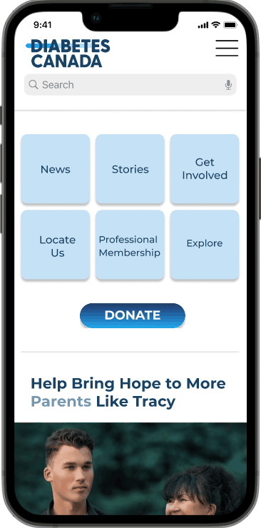
THE SOLUTION:
Our redesigned menu is better organized than the original one. We have tried to put important things in the order that a new user would want to see them in. Stories would show them other people in a similar situation, the CANRISK test would let them assess their own risk of developing diabetes, and the Get Involved section would allow them to be helpful in various ways.
MY ROLE: UI/UX Designer, Researcher (in collaboration with Gabrielle Lamanna, Melissa Young)
TOOLS: Figma, Zoom, Miro, Powerpoint, Trello
User Research
SWOT ANALYSIS

PROTO-PERSONA

• Our user research has shown that most users are 30+, any gender, and have a relative who has been diagnosed with diabetes (not a spouse like we originally assumed; usually a parent).
• They are worried about the diagnosed relative, as well as about their own health and inheriting the disease.
• Most people want both kinds of information (about themselves and the diabetic relative) to be in the same place and easy to find.
USER PERSONA

USER JOURNEY MAP

SURVEY RESULTS


Summary
• Most testers said the original website did not have the important information easily available; our redesign was more user-friendly.
• We have decided to make information about ways to help the newly diagnosed relative and other patients, as well as the user's potential risks, easier to find.
• Blue is the universal colour for diabetes, so we decided to keep the logo blue, and apply the blue colour scheme throughout the website.
Design
ORIGINAL HOMEPAGE

DESKTOP WIREFRAMES


MOBILE WIREFRAMES


PROTOTYPES